← Back to home

Projects

A mix of school, work and self-initiated projects. Click Read the full story to find out more!

Built at Infineon Technologies · 2025

Campaign Conversion Checker

A web app that matches campaign leads against registered business opportunities, so the team can see which campaigns actually converted.

  • Python
  • Flask
  • Pandas
  • Marketing Ops
Read the full story

The problem

Tracking whether campaign leads had converted into actual business opportunities required lengthy follow-ups with distributors. With MQL-to-pipeline conversion often taking up to six months, it was difficult to track campaign performance efficiently.

What I built

A web app that takes campaign lead data and the master opportunity file, then automatically matches leads against registered business opportunities. Users can filter results by factors such as time period, distributor and region.

Why it matters

It turns a manual, spreadsheet-heavy process into something the team can run in minutes, making it easier to track campaign performance consistently and identify which campaigns are driving actual business opportunities.

Python (Flask, Pandas, OpenPyXL) with a HTML/CSS/JavaScript front end.

View on GitHub →

MKTG101 · Product line extension · 2025

YouTrip Silver

By 2030, nearly one in four Singaporeans will be over 65. Almost none of the fintech they are told to use was designed with them in mind.

  • Product strategy
  • Market sizing
  • UX research
  • Go-to-market
Read the full story

The proposition

YouTrip Silver is a line extension of YouTrip's multi-currency wallet built for seniors: larger transaction text, stronger colour contrast, wider spacing between menu buttons, a stripped-back onboarding flow, and multilingual onboarding for non-English speakers. We also designed All-In-You, a centralised booking layer that auto-compares trips, expiry dates and insurance options so seniors are not forced to research five travel agencies to book one holiday.

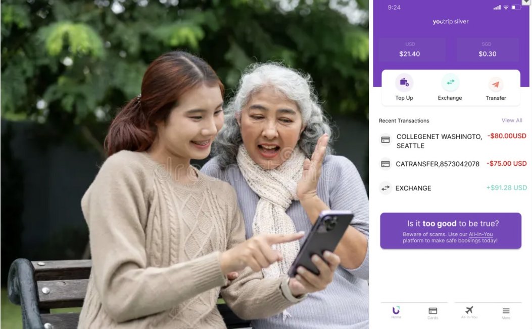
YouTrip Silver concept: a senior and a younger family member using the app together
The app, built to be handed between generations
Multilingual onboarding screen offering English, Chinese, Malay and Thai
Onboarding in four languages
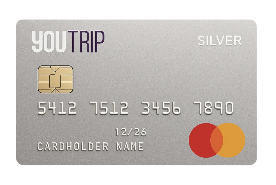
YouTrip Silver prepaid card design
The Silver card

Sizing the market

We built a bottom-up model across the SEA-6 markets, projecting population growth, carving out the over-65 segment, and benchmarking transaction volume per customer against Wise. Applying YouTrip's implied 60bp take rate gave a revenue potential of SGD 231 million in 2024 for the over-65 segment, growing at a 6.8% CAGR to SGD 339 million by 2030.

Testing it with real users

We put the prototype in front of 64 people (24 aged 18–30, 14 aged 31–64, and 26 aged 65+) and ran three tasks: exchange SGD to USD, view card details, and book a trip with health insurance. Participants narrated their thinking while we timed each page and noted tone and hesitation. Pages where people stalled got redesigned.

Taking it to market

Pricing stayed freemium, with a “Silver Spend & Save” launch cashback and Singpass age verification as a price fence. Promotion ran on two four-part video series, one with older celebrity couples and one with young influencers introducing the app to their own grandparents, plus celebrity tour partnerships with travel agencies and a reworked NATAS travel fair presence with fraud-safety talks and one-on-one consultations.

Silver Spend and Save cashback campaign artwork
The launch cashback campaign
SMU-X module · Client: Sentosa · Team Socrates

Sentosa Wellness Repositioning

Sentosa is not one destination. It is six, and each one was quietly telling visitors a different story.

  • Brand positioning
  • Primary research
  • Statistical analysis
  • Client delivery
Read the full story

An SMU-X module, delivered directly to Sentosa as the industry client.

The problem

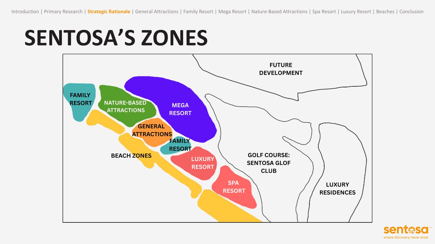
Sentosa's brand identity was fragmented. Each zone functioned as its own destination, which diluted the island's overall narrative and made a single compelling story impossible to tell.

Map of Sentosa split into its six zones
Six zones, six different promises to the visitor

What we did

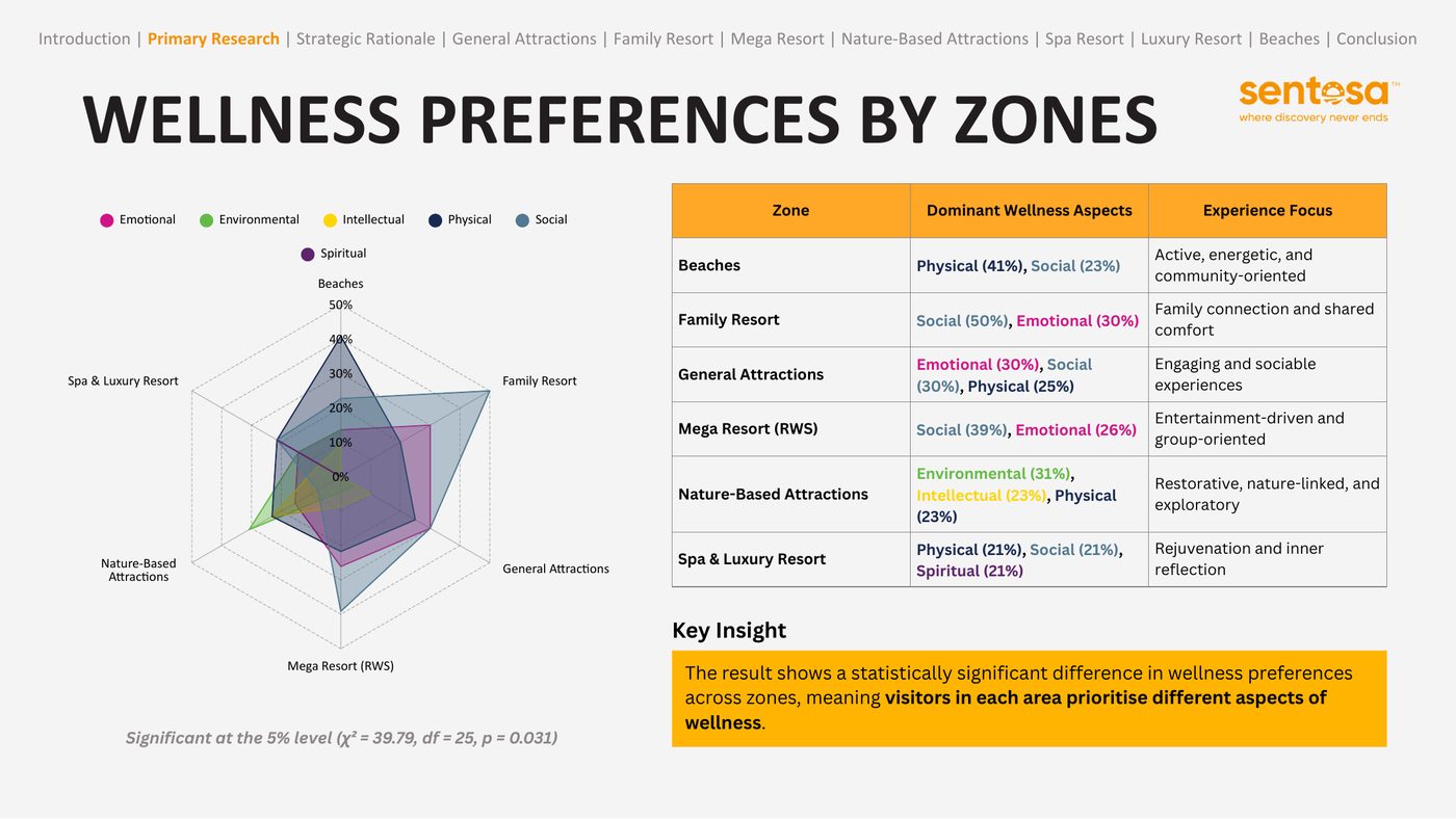
We ran 70 on-site surveys across all six zones, covering visit purpose, wellness priorities, sustainability attitudes and satisfaction. Chi-square testing confirmed the split was real, not noise: wellness preferences differ significantly by zone (p = 0.031), and so do visitor motivations (p = 0.019).

Radar chart and table of dominant wellness preferences by Sentosa zone
Every zone peaks on a different wellness dimension

The recommendation

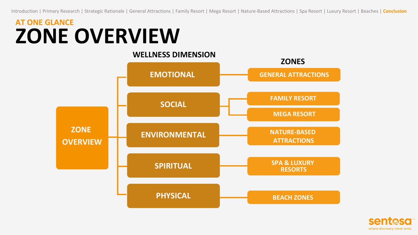
Rather than force one top-down rebrand, we treated the island's diversity as the strategic asset and proposed six zone-specific repositioning pathways, each expressing the wellness dimension its visitors already care about: physical at the Beaches, social at the Family and Mega Resorts, emotional at General Attractions, environmental at the Nature-Based zone, and spiritual at Spa & Luxury.

Diagram mapping each wellness dimension to a Sentosa zone
One dimension per zone, laddering to one island
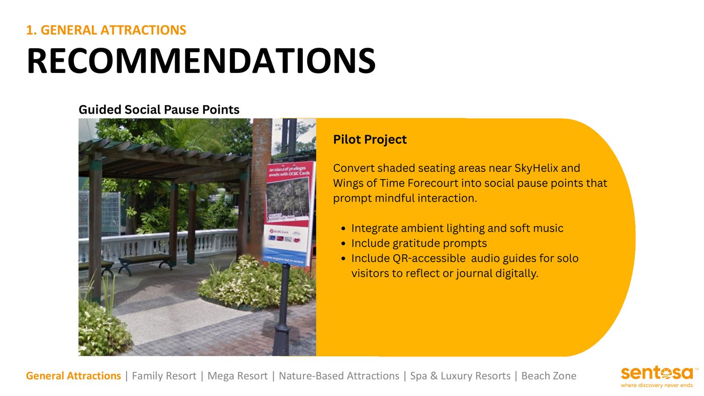
Pilot project slide for Guided Social Pause Points
A pilot project for each zone

Making it real

Each zone got a pilot-ready initiative matched to its profile, from Social Pause Points and “Wellness Wednesdays” family programming to mindfulness signage, check-in mini spa rituals and an ActiveWave wellness pop-up at Siloso. All six ladder up to one positioning line: Wellness by Design.

MGMT301 · AI for place branding · 2025

Taste Korea in SG

What if you could star in your own K-drama, and eat your way through it, without leaving Tanjong Pagar?

  • Place branding
  • Storytelling
  • Generative AI
  • Experience design
Read the full story

Developed around Visit Singapore's programming for the 50th anniversary of Singapore–South Korea diplomatic relations, a year of cultural exchange between the two countries.

The brief

The project set out to explore how AI could be used for place branding and positioning. Our subject was Tanjong Pagar, Singapore's Little Korea: a street everyone knows for Korean BBQ, and very little else.

Mapping the tastescape

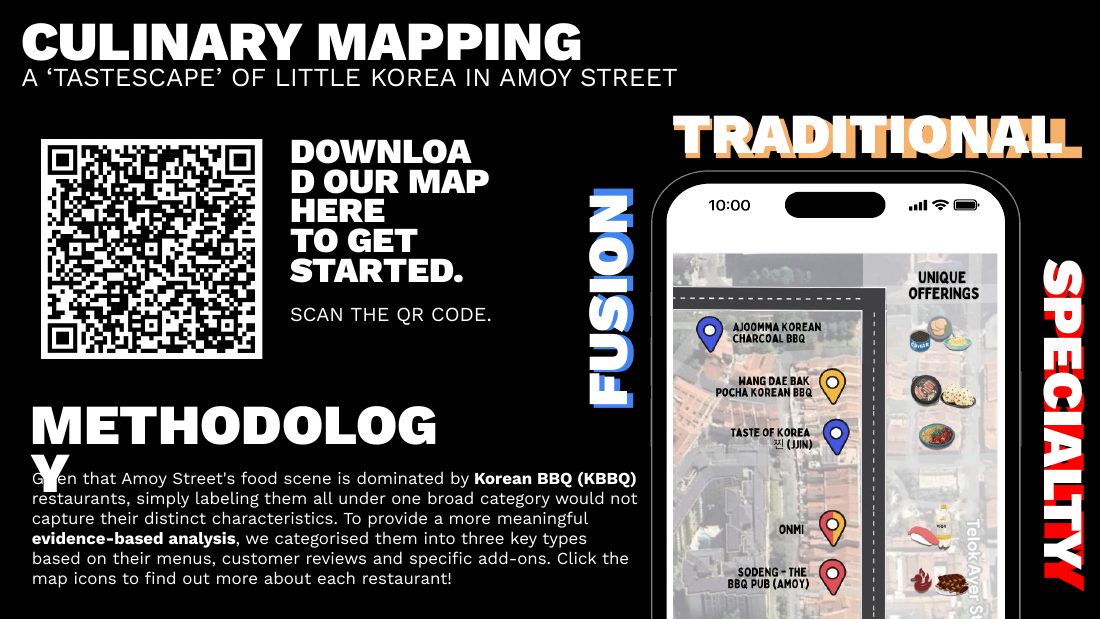
Because Amoy Street's food scene is so dominated by KBBQ, labelling it all as one category flattens everything interesting about it. We categorised the restaurants into three tastescapes — Fusion, Traditional and Specialty — based on their menus, customer reviews and specific add-ons, and delivered it as an interactive culinary map.

Culinary mapping slide showing the interactive map of Little Korea on Amoy Street
The tastescape map of Amoy Street

Seasons of Love

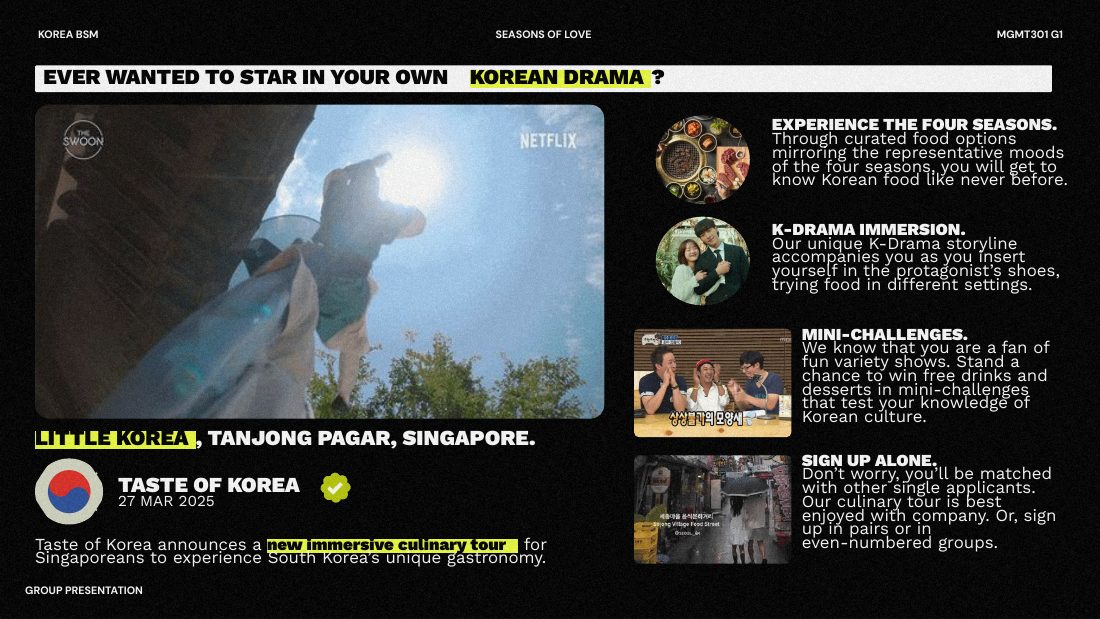
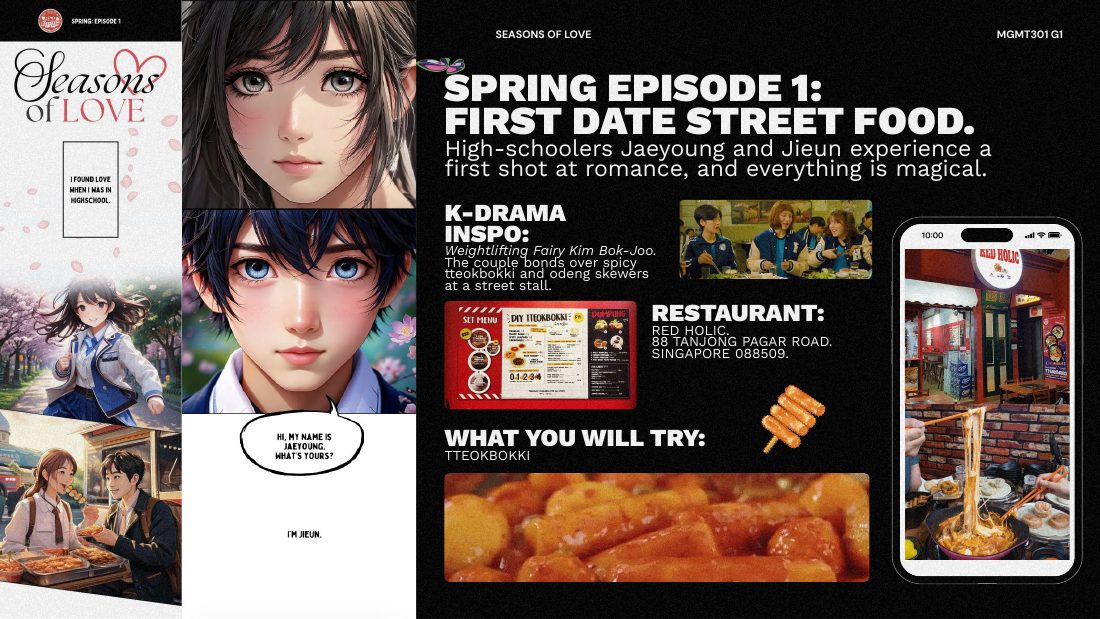
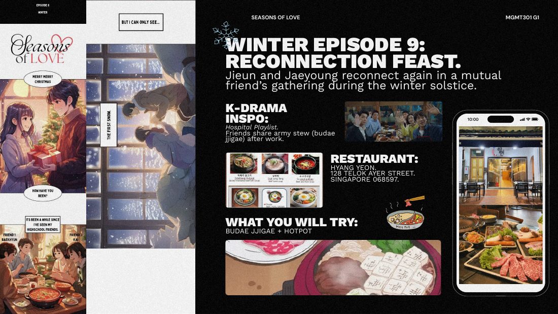
The centrepiece is a one-day culinary itinerary structured as a four-season K-drama arc. Spring is a high-school first date over tteokbokki; summer is a late-night ramyeon craving and a beach episode; autumn is a Chuseok family dinner and a breakup handled with jajangmyeon; winter is a bittersweet reconnection over budae jjigae. Every episode pairs a real K-drama reference with a real Tanjong Pagar restaurant and dish, so the storyline and the meal move together.

Slide introducing the immersive K-drama culinary tour concept
Four seasons, one storyline, real restaurants

Where the AI came in

We used AI to generate the drama itself as an anime, giving the itinerary a visual narrative participants step into rather than a food guide they read. Alongside it sit mini-challenges drawn from Korean variety shows, matched sign-ups for solo diners, and an OST to carry the mood between stops.

Spring episode one: first date street food, with AI-generated anime panels
Spring: first date, tteokbokki
Winter episode: reconnection feast, with AI-generated anime panels
Winter: reconnection, budae jjigae

The point

Storytelling is the positioning. The food was always there; the narrative is what turns a street of restaurants into a place worth travelling across the island for.

Read the CNA article →